The Printing Museum
Printing Museum Annual Gala
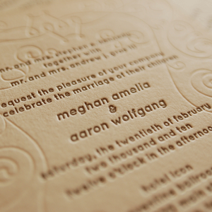
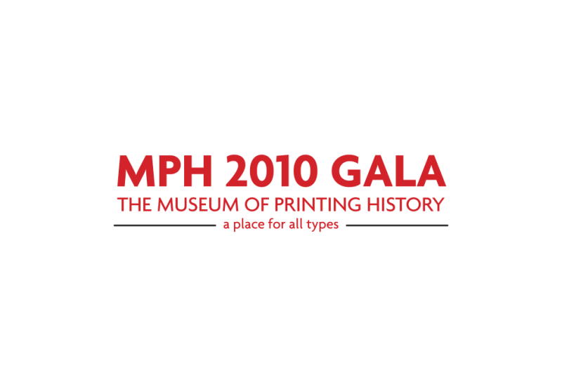
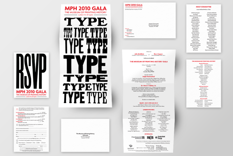
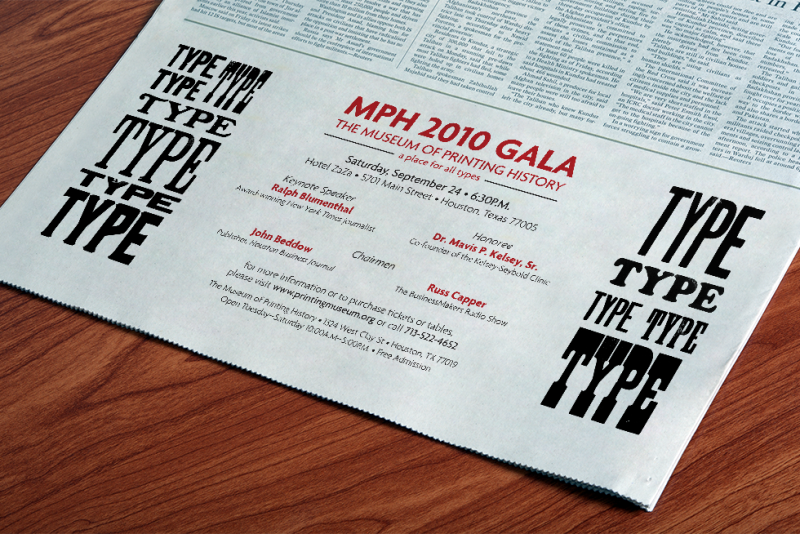
I was asked to create a concept for the museum’s annual fundraising gala and design the invitation suite for the event. Collaborating with the Curator, we came up with the tagline “A place for all types” — an indication that the museum welcomes everyone and a reference to the museum’s extensive wood and lead type collection.
Using the museum’s wood type collection, I printed the word “TYPE” several times for use in the design. The lockup used to print the visuals for the branding was used again during the gala to print souvenir posters for attendees.
Continuing the “type” theme, I chose a font styled after Johnston, the infamous font used for the London Underground.
The “place for all types” theme was used for multiple years beyond the gala it was conceptualized for.
Summer Books Arts Brochures
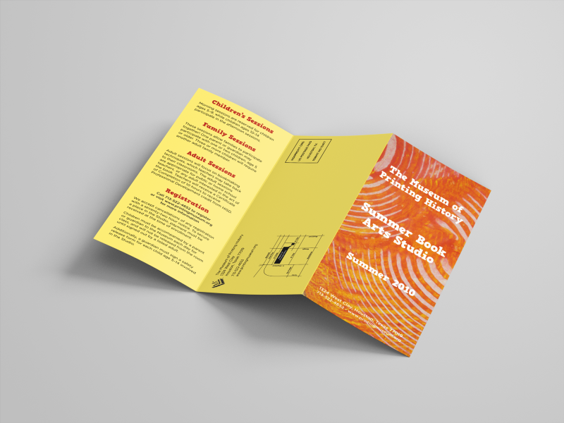
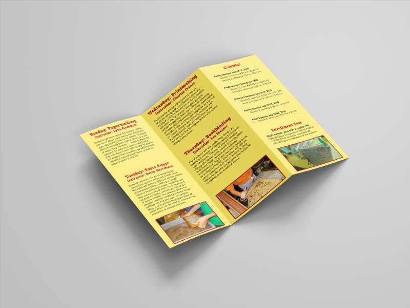
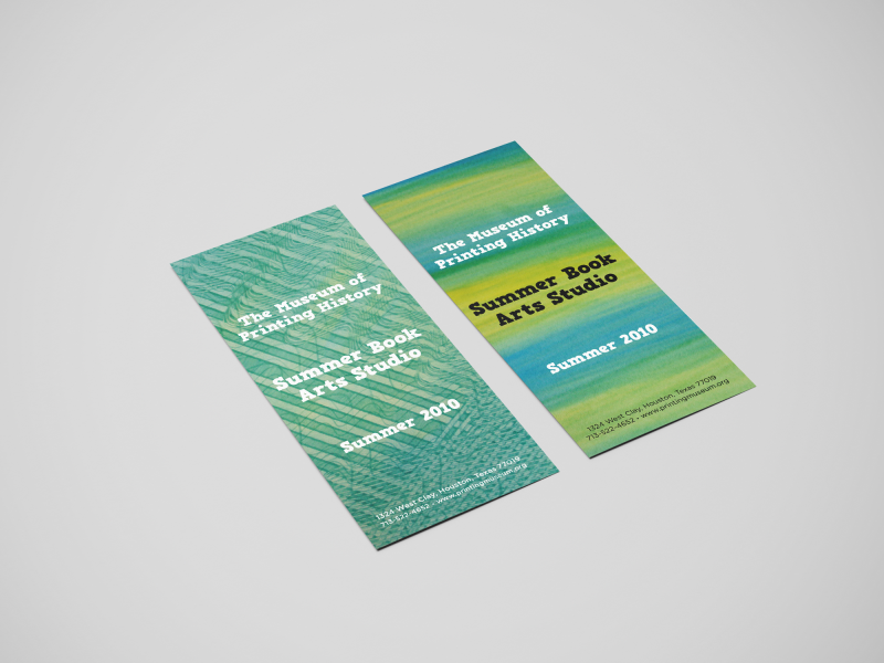
Each summer, The Printing Museum hosted a four day “summer camp” style series of printing classes for children (and adults!) to sample the classes offered by the museum.
Because the classes were primarily aimed towards kids, families, and teachers, I used bright, colorful art created in previous classes for inspiration in the brochure design.
Exhibition Mailers
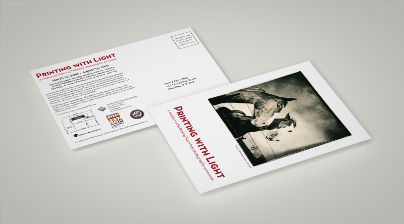
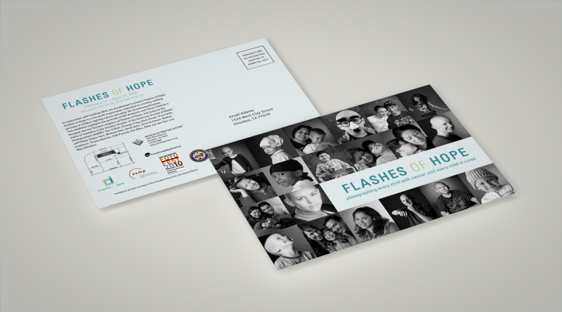
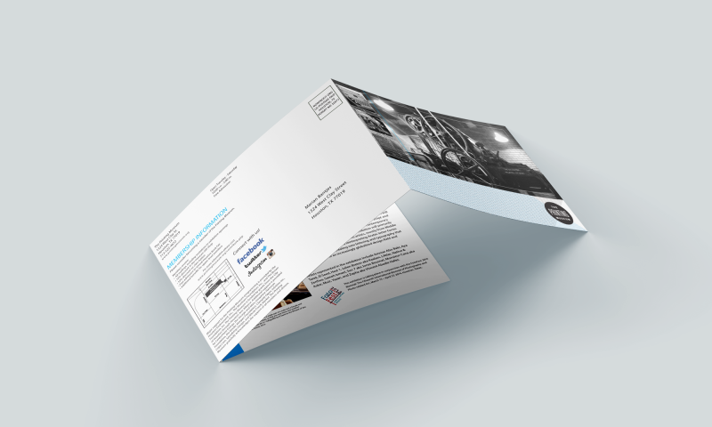
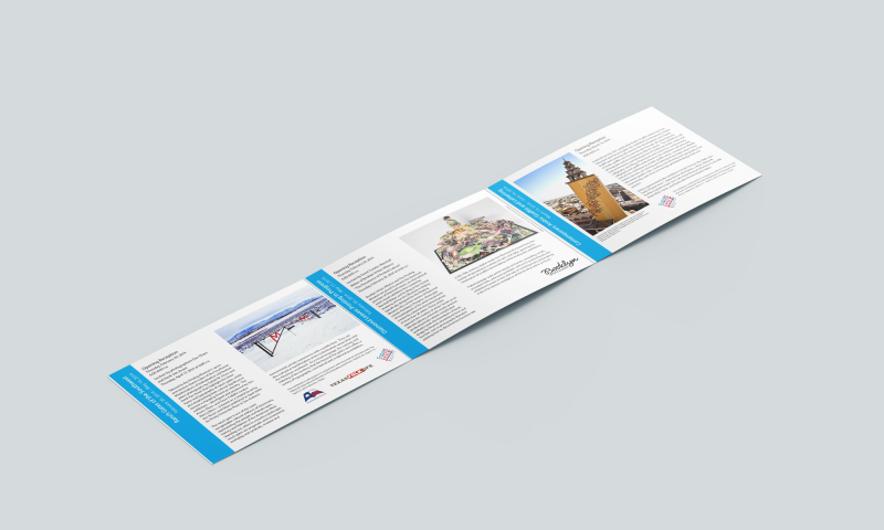
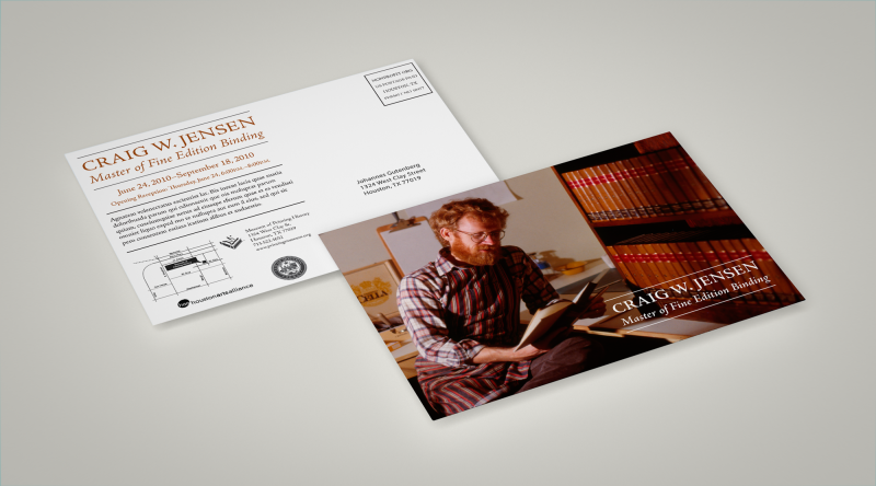
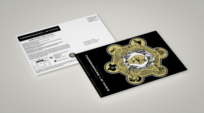
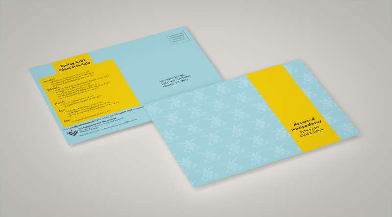
For each new exhibition, the museum sent postcards to patrons to announce exhibition openings and related museum events. When available, I used existing exhibition branding and imagery for the design. If the exhibition didn’t have existing branding, I used pieces in the exhibition to inspire my own designs.
Originally, the mailers were a flat, two-sided design, but we changed to a tri-fold design in 2014. I designed the template for the new tri-fold mailer and this template remained in use for years.
