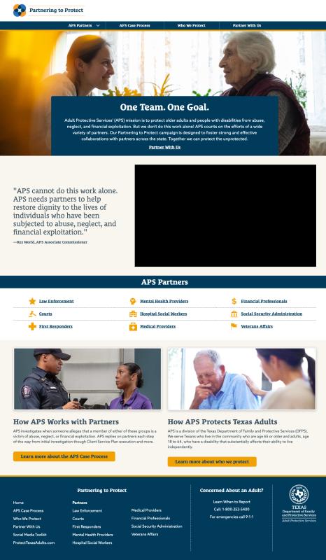
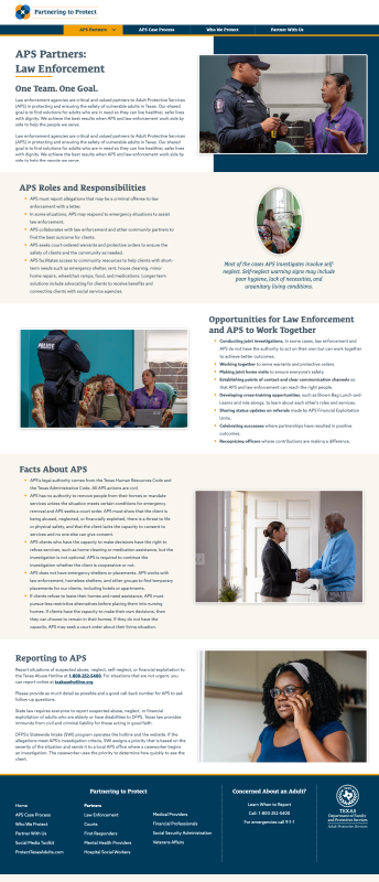
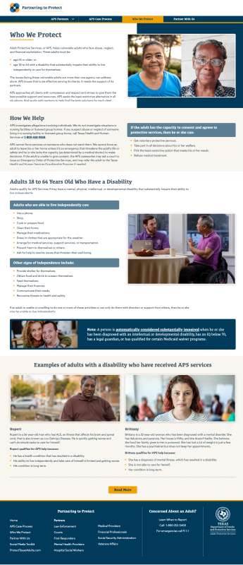
APS Website Redesign
User Flow
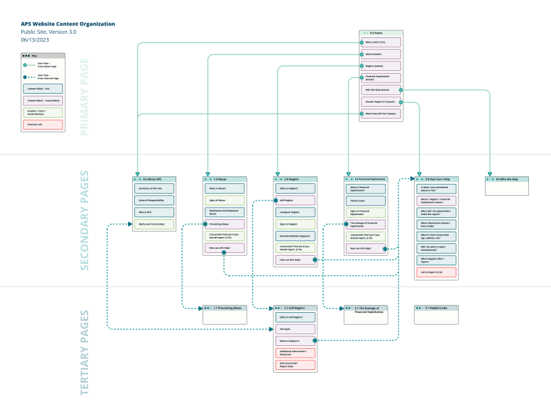
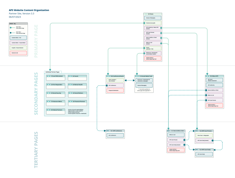
The site maps began as simple content bulleted lists / outlines in Word. Once we knew what information was going to be presented on the site and where that information would live, it was very easy to start connecting the pages together and designing the user flow.
I wanted to keep the site map simple so it could easily be understood by a non-technical client as well as someone who is used to looking at UX / flow charts all day.
To achieve this, I used multiple visual cues to indicate page type, content block type, and different kinds of user flow:
Page style
- Primary, secondary, and tertiary pages have different color schemes as well as being placed vertically according to page hierarchy.
User flow arrows
- Solid lines: navigation from the primary page to lower level pages.
- Dashed lines: navigation within “internal” pages.
Content block styling
- Blue: full blocks of content that do not direct the user elsewhere to learn more.
- Purple: “teaser” blocks of content where the user must navigate to another page to get all of the information.
- Green: content that is completely graphical or visual. Call to action blocks are considered graphic elements because they will be designed to grab the reader’s attention.
- Red: content that will lead the user away from the site—links to the official DFPS site, DFPS partners, etc.
Public Site Map
Partner Site Map
Wireframes
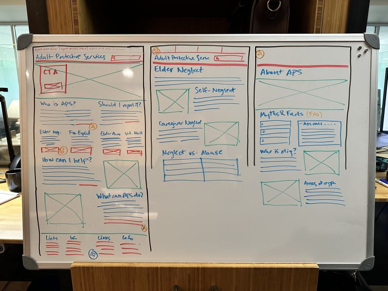
To create the low fidelity wireframe roughs, I started with a whiteboard using different color dry erase markers to differentiate the types of content on the page.
- Red = link / interactive element
- Green = image / graphic
- Blue = text
Basic user flow was indicated with (A) and (B) notations in orange to indicate which links/buttons would lead to which pages.
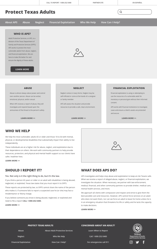
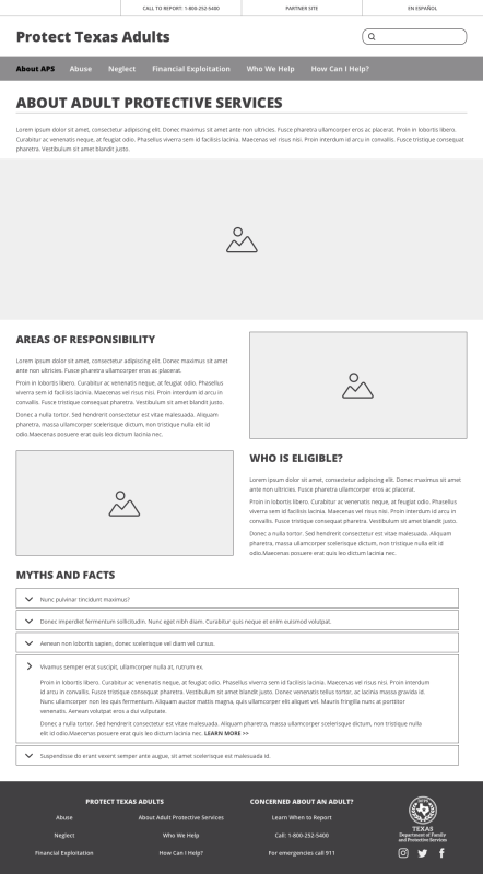
The whiteboard drawings were then recreated in Sketch as high fidelity wireframes.
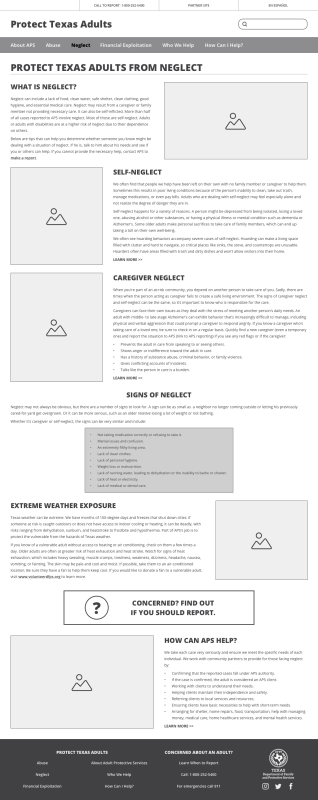
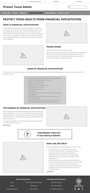
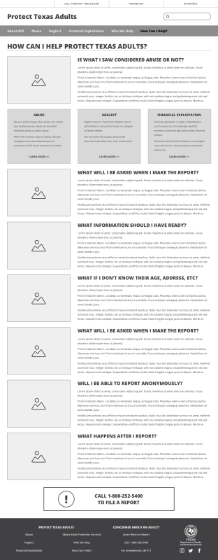
Page layouts were designed to be “modular”, which would allow for easy changing of the order of content on the page. I created multiple page types with several styles of content display to show the client the versatility and flexibility of the design.
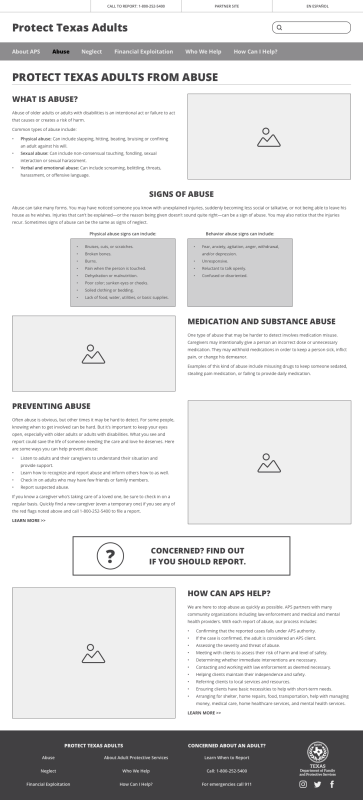
I used design continuity between pages of the same content type to give a subtle cue to the reader the pages were related. The three primary areas of APS concern—abuse, neglect, and financial exploitation—all have the same basic page layout:
- a summary of the area of concern, always laid out text on the left / image on the right
- the main content block
- a call to action to file a report
- details about how APS can help, always laid out image on the left / text on the right
Final Site
